
Golden Signals Monitoring for SREs: a Practical Guide
Discover the role of golden signals monitoring for SREs. Optimize user experience by mastering latency, traffic, errors, and saturation today!
The four golden signals — latency, traffic, errors, and saturation — are the user-facing symptom metrics every SRE should instrument first. Introduced in the Google SRE book’s chapter on monitoring distributed systems, they answer one question before anything else: is the user experiencing pain right now? The role of golden signals monitoring is not to replace full observability; it is to give you a fast, consistent signal-to-alert pipeline that cuts mean time to detect (MTTD) and mean time to resolve (MTTR) on the incidents that actually matter.
Start here:
- Instrument all four signals on every critical service before adding any other telemetry.
- Map each signal to an SLI/SLO so alert thresholds reflect real user expectations, not arbitrary percentages.
- Configure symptom-based paging (latency and error spikes) and treat saturation as a non-paging leading indicator until it crosses a capacity threshold.
Per-signal measurement patterns, PromQL examples, and alerting rules follow in the sections below.
Table of Contents
- Why do the four signals cover what actually matters?
- How should you measure latency without misleading yourself?
- How do you classify errors without drowning in false positives?
- Which saturation metric should you actually watch?
- How do golden signals map to SLIs, SLOs, and alert severity?
- What are the best Prometheus instrumentation patterns?
- Which tools should you assemble for golden-signal dashboards?
- Three incident patterns every SRE should recognize
- When should you go beyond the four golden signals?
- How do you roll out golden-signal monitoring in practice?
- Key Takeaways
- What most teams get wrong about golden signals
- Devopsaitoolkit has the templates to skip the setup grind
- Useful sources and further reading
Why do the four signals cover what actually matters?
The Google SRE book chose these four because they describe service health from the user’s perspective, not the host’s. A node can show 20% CPU while users time out waiting for a database lock. Host-level counters miss that failure entirely. Golden signals catch it because they measure what the user experiences: how long requests take, how many arrive, how many fail, and whether the system is running out of room to handle more.
Think of the chain this way: a signal rises, that rise is a symptom, the symptom maps to user harm, and the harm determines alerting priority. Latency and errors are direct symptoms. Traffic provides context. Saturation is a leading indicator of future symptoms.
Monitoring vs. observability is worth separating here. Monitoring tells you something is wrong. Observability tells you why. Golden signals live in the monitoring layer: they fire the alert. Traces and logs live in the observability layer: they explain the root cause. You need both, but the golden signals are the entry point. Dynatrace’s knowledge base frames it well: the four signals give a high-level, actionable view of system performance, but they must be complemented by traces and logs for root-cause analysis.
The four signals are sufficient when your service is a request-driven HTTP API or RPC endpoint and you have clear SLOs. They start to fall short when you need to understand why latency spiked (add traces), when failures are silent or content-based (add logs), or when you need to correlate technical health with business outcomes (add business metrics). More on that in the “beyond” section.
How should you measure latency without misleading yourself?
Latency is the time to service a request. That sounds simple until you realize that averaging it destroys the signal. A p50 of 120ms can coexist with a p99 of 8 seconds, and the average will look fine while one in a hundred users waits eight seconds. Use percentiles.
The preferred instrument is a request-duration histogram (histogram_type in Prometheus). Histograms store bucket counts that you can aggregate across instances and time windows, which summaries cannot do correctly. Common metric names:
http_request_duration_seconds(HTTP services)grpc_server_handling_seconds(gRPC)db_query_duration_seconds(database clients)
A p99 PromQL query over a 5-minute window looks like this:
histogram_quantile(
  0.99,
  sum(rate(http_request_duration_seconds_bucket[5m])) by (le, service)
)
For alerting, a reasonable starting point is: page if p99 exceeds your SLO latency threshold for more than two consecutive minutes. Non-paging warnings can fire at p90. Adjust the window to match your traffic volume; low-traffic services need longer windows to avoid flapping.
Pro Tip: Always separate error-latency from success-latency. A fast 500 error completes in 2ms and will drag your p99 down, making the dashboard look better than it is during an outage. Track http_request_duration_seconds with a status="success" label filter for your SLO latency SLI. The Dash0 implementation guide makes this point explicitly: folding failed requests into latency without separating them produces misleading dashboards during incidents.
Retention note: high-resolution histogram data (15-second scrape intervals) is expensive to keep long-term. Downsample to 1-minute resolution after 7 days and 5-minute resolution after 30 days. More on that in the implementation patterns section.
How do you classify errors without drowning in false positives?
Errors measure failed requests. The Google SRE book distinguishes three types, and treating them the same in your alerting will generate noise:
| Error type | Example | Alert behavior |
|---|---|---|
| Explicit | HTTP 5xx, gRPC INTERNAL | Page above SLO error budget burn rate |
| Implicit | HTTP 200 with malformed body | Non-paging; requires content inspection |
| Policy | Request exceeds SLA latency | SLO burn-rate alert; non-paging at low rates |
Always express error alerts as a ratio, not a raw count: errors / total_requests. A raw count of 100 errors per minute is meaningless without knowing whether total traffic is 200 RPS or 200,000 RPS.
A basic PromQL error ratio:
sum(rate(http_requests_total{status=~"5.."}[5m]))
/
sum(rate(http_requests_total[5m]))
For dashboard widgets, two are worth building immediately: an error ratio time-series overlaid on traffic, and an error budget burn visualization that shows how fast you are consuming the SLO error budget. New Relic’s APM monitoring guidance recommends using fixed 5-minute windows for initial alert rules and tightening them once you understand your service’s normal error patterns.
Transient errors (single-instance restarts, brief network blips) should be deduplicated before paging. A common pattern: require the error ratio to exceed threshold for two consecutive evaluation windows before firing a page. Systemic errors (ratio climbing across all instances) should page immediately.
Which saturation metric should you actually watch?
Saturation is the one signal that predicts problems before users feel them. It measures how full the resource is that limits your service’s throughput. The catch: that resource is different for every service, and picking the wrong one gives you false confidence.
Common saturation resources by service type:
- Stateless API: CPU utilization (
node_cpu_seconds_total), connection pool usage - Database: disk I/O utilization, connection pool (
pg_stat_activitycount vs.max_connections) - Cache (Redis/Memcached): memory utilization, eviction rate
- Message queue: queue depth, consumer lag
- File server / object store: disk space, file descriptor count (
process_open_fds / process_max_fds)
The Google SRE book notes that latency increases are often an early signal of saturation. Watching p99 latency climb before CPU or memory hits a hard ceiling is a reliable early warning pattern.
Pro Tip: Design for N+1 redundancy and set your saturation alert threshold at 70–80% of capacity, not 95%. By the time a resource hits 95%, you often have minutes, not hours, to respond. Alerting at 75% gives you time to scale before users notice.
Saturation investigation checklist when an alert fires:
- Check p99 latency trend for the same service over the past 30 minutes.
- Inspect queue depth and connection pool usage side by side.
- Compare current traffic rate against the baseline for that time of day.
- Check headroom: how far is the saturating resource from its hard limit?
- Verify whether the saturation is isolated to one instance or spreading across the fleet.
Saturation data feeds capacity planning directly. Track weekly peak saturation per service and use it to project when you will need to scale. This is where cloud cost visibility tooling becomes useful: saturation trends and scaling decisions have direct cost implications.
How do golden signals map to SLIs, SLOs, and alert severity?
Splunk’s SRE metrics guide makes the connection explicit: tracking golden signals alongside SLIs, SLOs, and SLAs in a unified framework lets teams set targets and rapidly detect user-impacting issues. Here is how the mapping works in practice.
SLI examples derived from golden signals:
- Success-latency SLI: proportion of requests with
status="success"completing under 300ms over a 28-day rolling window. - Error-rate SLI: proportion of requests returning non-5xx responses over a 28-day rolling window.
- Saturation SLI: proportion of time connection pool utilization stays below 80%.
SLO examples:
- 99.5% of successful requests complete under 300ms.
- 99.9% of requests return non-5xx responses.
Alerting severity mapping:
| Signal | Condition | Severity | Action |
|---|---|---|---|
| Latency | p99 > SLO threshold for 2 min | Critical | Page on-call |
| Errors | Error ratio > SLO burn rate | Critical | Page on-call |
| Traffic | Anomaly (drop or spike) | Warning | Slack notification |
| Saturation | Resource > 75% for 10 min | Warning | Slack notification |
| Saturation | Resource > 90% for 5 min | Critical | Page on-call |
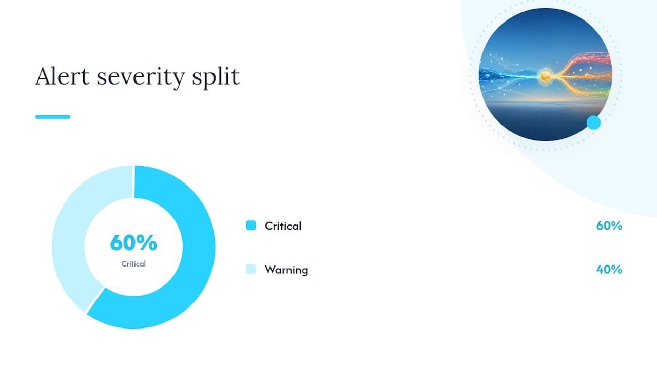
Burn-rate alerting is more reliable than fixed-threshold alerting for latency and errors. A burn rate of 1.0 means you are consuming your error budget at exactly the rate that would exhaust it over the SLO window. Paging at a burn rate of 2.0 or higher over a short window (1 hour) catches fast-burning incidents. A slower burn rate (1.1 over 6 hours) triggers a non-paging warning for gradual degradation.
To reduce alert noise: group related alerts by service before routing, deduplicate alerts that fire within the same 5-minute window, and route warning-severity alerts to Slack rather than paging. Reserve pages for burn rates and saturation conditions that directly threaten your SLO.
What are the best Prometheus instrumentation patterns?
Prometheus is the de facto metrics store for most open-source SRE stacks. Getting the implementation right from the start saves painful migrations later.
Metric naming conventions:
- Use
snake_caseand include the unit in the name:http_request_duration_seconds, notrequest_time. - Suffix counters with
_total:http_requests_total. - Suffix histograms with the unit, no suffix needed for the
_bucket,_sum,_countauto-generated series.
Histogram vs. summary:
| Dimension | Histogram | Summary |
|---|---|---|
| Aggregation across instances | Yes — buckets are additive | No — quantiles are not aggregatable |
| Percentile accuracy | Approximate (bucket boundaries) | Exact (client-side computation) |
| Flexibility | Quantiles computed at query time | Quantiles fixed at instrumentation time |
| Recommended for | Multi-instance services | Single-instance, pre-defined quantiles |
Use histograms for any service with more than one instance. Summaries are only appropriate for single-instance jobs where you know exactly which quantiles you need before deploying.
Scrape and retention guidance:
- Scrape interval: 15 seconds for critical services, 60 seconds for background jobs.
- Short-term retention: 15-second resolution for 7 days.
- Downsampled retention: 1-minute resolution for 30 days, 5-minute resolution for 1 year.
- For long-term storage, use a remote write target (Thanos, Cortex, or a managed service). The cost tradeoffs of remote storage versus local retention are worth reviewing alongside your cloud cost optimization strategy.
Label hygiene:
- Keep label sets stable across deployments. Adding a new label value mid-incident creates new time series and breaks dashboards.
- Never use unbounded values (
user_id,trace_id,request_pathwith path parameters) as label values on counters or histograms.
Which tools should you assemble for golden-signal dashboards?
You need four layers: a metrics store, a visualization layer, a tracing and log backend, and optionally a managed APM layer. Here is the practical breakdown.
Metrics store: Prometheus Prometheus scrapes metrics from instrumented services and stores them locally. Its PromQL query language is purpose-built for the rate, histogram_quantile, and ratio calculations the golden signals require. For production use, pair it with a remote write backend for durability and long-term retention.
Visualization: Grafana Grafana connects to Prometheus (and most other data sources) and lets you build golden-signal dashboards quickly. The dashboard widget checklist for each service:
- Request-duration histogram panel (p50, p90, p99 over 5-minute windows)
- Traffic time-series (RPS or QPS, labeled by endpoint and version)
- Error ratio panel (errors/total, with SLO threshold line)
- Saturation gauge showing current utilization and headroom
Grafana’s alerting engine can evaluate PromQL rules and route to Alertmanager, Slack, or PagerDuty. APM tools like New Relic ship prebuilt golden-signal dashboards and alert templates, which cuts initial setup time significantly.
Managed APM: Dynatrace Dynatrace auto-instruments services and surfaces golden signals without manual metric instrumentation. It adds AI-assisted anomaly detection on top of the four signals. The tradeoff: cost scales with host count and ingestion volume, and you have less control over metric cardinality and retention than with a self-managed Prometheus stack.
Tracing and logs OpenTelemetry is the standard instrumentation layer for traces and structured logs. It can also emit request-duration histograms that cover latency, traffic, and explicit errors, with host and Kubernetes metrics covering saturation. Correlating these two streams during an incident is the harder operational problem, but it is what separates fast root-cause analysis from guesswork.
Three incident patterns every SRE should recognize
Golden signals rarely fire in isolation. The combination of which signals are elevated tells you more than any single metric. Here are three patterns worth having in your runbook.
Pattern 1: Latency up + errors up + traffic flat This is an internal service failure. Traffic has not changed, so the problem is not a demand spike. Start here:
- Check recent deployments in the last 30 minutes (
kubectl rollout historyor your CI/CD pipeline). - Inspect error logs for the affected service for exception types and stack traces.
- Check downstream dependency health (database, cache, external API).
- If a bad deploy is confirmed, trigger a rollback immediately before investigating further.
- Verify error ratio drops after rollback; if it does not, the issue is environmental, not code.
Pattern 2: Latency up + traffic up + saturation climbing This is a capacity issue. The system is handling more load than it was sized for.
- Confirm traffic increase is legitimate (not a DDoS or scraper flood).
- Identify the saturating resource (CPU, connection pool, queue depth).
- Scale horizontally if the resource is CPU or connection-bound; scale vertically or tune pool sizes if memory-bound.
- Apply rate limiting or throttling at the ingress layer to protect downstream services while scaling catches up.
- Set a post-incident task to update capacity projections based on the new traffic baseline.
Pattern 3: Errors spike + traffic flat + saturation normal This pattern points to a bad deploy or a dependency failure. The system has capacity, traffic is normal, but requests are failing.
- Check the error type: are they all the same HTTP status code or gRPC status?
- Compare error rate by service version (canary vs. stable) to isolate whether the new version is responsible.
- Check dependency health endpoints and recent upstream changes.
- If the error is isolated to the new version, roll back the canary.
- If errors span all versions, check for expired certificates, rotated secrets, or infrastructure changes.
Pro Tip: Route warning-severity alerts to a dedicated Slack channel, not to the same channel as pages. A single noisy channel trains engineers to ignore it. The Devopsaitoolkit guide on routing alerts to Slack without noise covers deduplication and channel design patterns that keep the signal-to-noise ratio high.
Pro Tip: For alert routing security, always use secured webhook configurations when sending incident data to Slack or Teams. Exposed webhook URLs are a real attack surface.
When should you go beyond the four golden signals?
The four signals are sufficient for detecting that something is wrong. They are rarely sufficient for explaining why. Cisco’s developer guide on golden signals and the Dynatrace knowledge base both note that complex environments require complementary telemetry for full-stack observability.
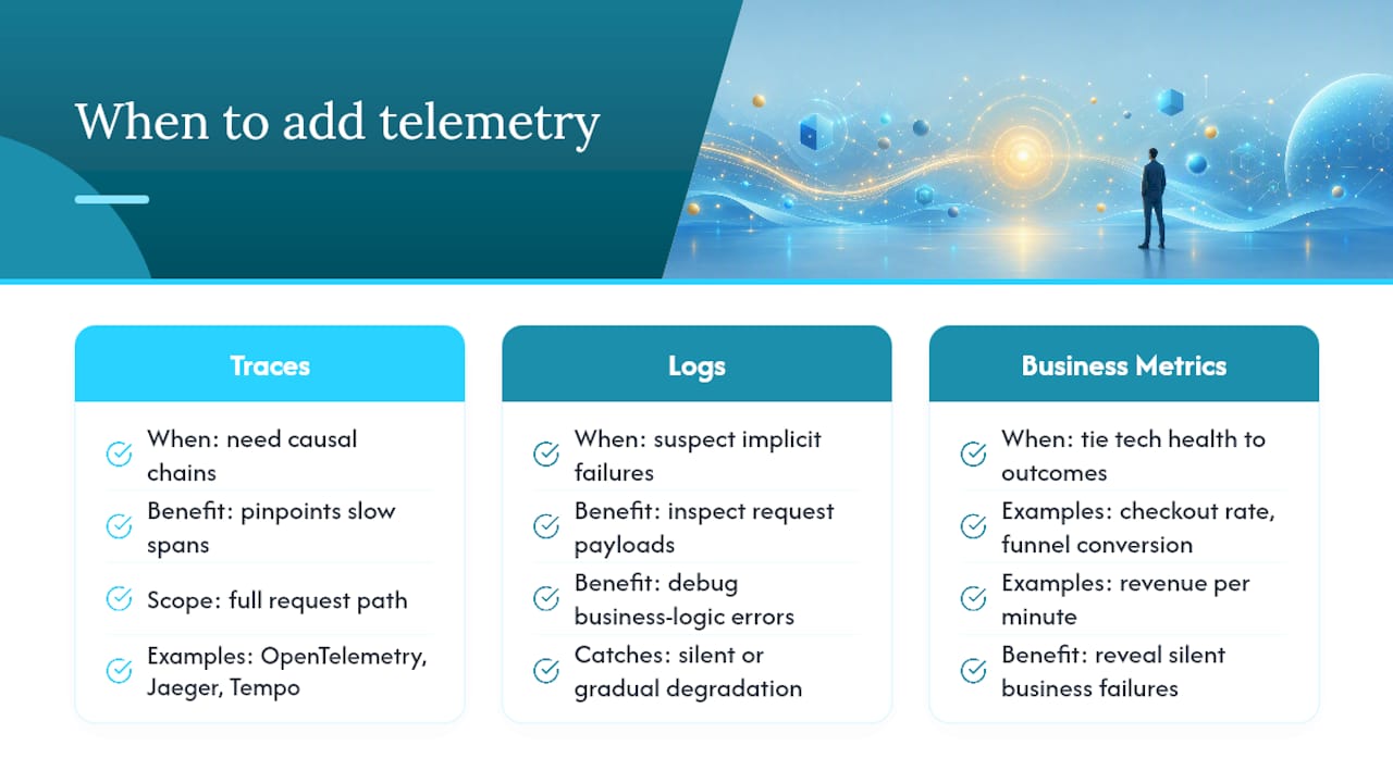
Add distributed traces when: You need causal chains across microservices. A latency spike in Service A might originate in Service C three hops away. Traces show the full request path and pinpoint which span is slow. OpenTelemetry with Jaeger or Tempo is the standard open-source path.
Add structured logs when: You suspect implicit failures (HTTP 200 with wrong content), need to inspect request payloads, or are debugging business-logic errors that do not surface as 5xx responses. Logs also catch silent degradation that golden signals miss entirely — a topic worth reading about in depth if your services have gradual failure modes.
Add business metrics when: You need to correlate technical health with user outcomes. Checkout completion rate, signup funnel conversion, and revenue per minute are business metrics that can spike or drop independently of your technical golden signals. A payment processor returning 200s with silent failures will look healthy in Prometheus but show up immediately in a revenue-per-minute chart.
The RED framework (Rate, Errors, Duration) and the USE framework (Utilization, Saturation, Errors) complement the golden signals well. RED aligns with request-driven services and is essentially a subset of the golden signals. USE focuses on infrastructure resources and maps closely to saturation. Many teams run both in parallel: golden signals for user-facing alerting, USE for infrastructure capacity planning.
How do you roll out golden-signal monitoring in practice?
A minimum viable rollout covers one critical service with all four signals instrumented, dashboards built, and alerts configured. That fits comfortably in one to two sprints.
- Sprint 1, days 1–3: Instrument the service. Add
http_requests_total,http_request_duration_seconds(histogram), and an error label. Verify metrics appear in Prometheus. - Sprint 1, days 4–5: Build the Grafana dashboard. Four panels: p99 latency, RPS, error ratio, and the primary saturation metric for this service.
- Sprint 2, days 1–2: Define SLIs and SLOs. Write the first alert rules (p99 latency, error ratio, saturation warning).
- Sprint 2, days 3–4: Configure alert routing. Latency and error pages go to PagerDuty. Saturation and traffic anomalies go to Slack.
- Sprint 2, day 5: Run a tabletop incident exercise using the three patterns above. Verify alerts fire correctly and runbooks are reachable.
- Week 5 onward: Expand to the next two or three critical services. Repeat.
Success criteria to track:
- MTTD drops below 5 minutes for latency and error incidents on instrumented services.
- MTTR improves as engineers use signal combinations to triage faster.
- SLO dashboards surface real user impact, not just infrastructure health.
- Alert-to-page ratio stays below 3:1 (three alerts per page, not thirty).
Cost considerations: a self-managed Prometheus stack with Grafana is low-cost but requires operational overhead. Managed APM (Dynatrace, and similar platforms) reduces setup time but scales in cost with ingestion volume. For most teams, starting with open-source and migrating high-value services to managed APM as budget allows is the practical path.
Key Takeaways
The most reliable path to faster incident resolution is instrumenting all four golden signals, mapping them to SLOs, and paging on symptoms rather than causes.
| Point | Details |
|---|---|
| Instrument all four signals first | Latency, traffic, errors, and saturation cover user-facing health before any other telemetry. |
| Separate error-latency | Track success-latency and error-latency independently to avoid misleading SLO dashboards during incidents. |
| Page on symptoms, not causes | Alert on latency and error burn rates; treat saturation as a non-paging leading indicator until it threatens capacity. |
| Extend telemetry deliberately | Add traces for causal chains, logs for implicit failures, and business metrics for user-outcome correlation. |
| Devopsaitoolkit accelerates rollout | Prompt packs, PromQL templates, and runbook playbooks cut instrumentation and alert-configuration time across sprints. |
What most teams get wrong about golden signals
The conventional wisdom says “instrument the four golden signals and you are covered.” That is true for detection. Where teams consistently stumble is the gap between detection and action.
I see two failure modes repeatedly. The first is treating saturation as a page-worthy alert from day one. Saturation is a leading indicator, not a symptom. Paging on 80% CPU at 2 AM trains your on-call rotation to distrust alerts. Reserve pages for burn rates and hard capacity limits; route saturation warnings to Slack and let the team act during business hours.
The second failure mode is skipping the error-latency separation. It sounds like a minor implementation detail until you are in an incident at midnight, your p99 looks fine, and you cannot figure out why users are complaining. Fast errors (2ms 500s) mask slow successes in a blended histogram. Separate them at instrumentation time, not during the incident.
The broader point: golden signals are a starting framework, not a finish line. The Cisco developer guide and the Dynatrace knowledge base both make clear that complex distributed systems eventually demand traces and logs alongside the four signals. Build the golden-signal foundation first, get your SLOs in place, then layer in the complementary telemetry where incidents keep escaping your alerts.
Devopsaitoolkit has the templates to skip the setup grind
Building golden-signal monitoring from scratch means writing PromQL from memory, configuring Alertmanager routing rules, and assembling Grafana dashboards panel by panel. That setup work is where most rollouts stall.
Devopsaitoolkit ships battle-tested prompt packs, PromQL snippet libraries, and incident runbook templates built specifically for engineers managing Prometheus, Grafana, Kubernetes, and production infrastructure. The golden-signal instrumentation templates cover all four signals with correct histogram configurations, label hygiene, and SLO-aligned alert rules out of the box. The incident playbook templates map directly to the three triage patterns covered in this article.
If you are starting a new service rollout or retrofitting monitoring on an existing stack, the Linux Admins AI Prompts pack includes copy-paste prompts for generating instrumentation configs, alert rules, and triage scripts. Skip the blank-page problem and get your first golden-signal dashboard live in a single sprint.
Useful sources and further reading
The sources below are the primary references behind this guide. Each is worth bookmarking.
-
Chapter 6: Monitoring Distributed Systems — Google SRE Book — The original definition of the four golden signals and the authoritative argument for symptom-based paging over cause-based alerting. Read the full chapter; the surrounding context on white-box vs. black-box monitoring is equally useful.
-
SRE Metrics: Four Golden Signals and SRE KPIs — Splunk — Practical coverage of how golden signals map to SLIs, SLOs, and SLAs in a unified framework.
-
What Are Golden Signals? — Dynatrace Knowledge Base — Concise vendor perspective on the four signals and their limitations; useful for understanding where managed APM adds value beyond open-source stacks.
-
Why You Need to Monitor the Four Golden Signals — New Relic — Practical notes on prebuilt dashboards, recommended alert windows, and APM-layer implementation patterns.
-
What Are the Four Golden Signals? — Dash0 — Solid implementation notes on error-latency separation, histogram instrumentation, and OpenTelemetry correlation.
-
What Are the Golden Signals SRE Teams Use? — Cisco Developer — Industry perspective on combining golden signals with broader observability telemetry and the practical limits of the four-signal approach.
Recommended
- Best AI Tools for SRE Teams in 2026 (A Practitioner’s Guide)
- SRE vs DevOps Differences Explained for Engineers
- AI Anomaly Detection for SRE: Less Noise, Faster MTTR
- Observability for Incidents: The Signals You Need Before 3am
Get 500 Battle-Tested DevOps AI Prompts — Free
500 battle-tested, copy-paste AI prompts engineered by a senior systems engineer — every one with fill-in placeholders and safety/back-out notes. Drop your email and it's yours.
- 500 prompts: Linux · Kubernetes · Terraform · OpenStack · GitLab · Docker · Monitoring · Incident Response
- Instant PDF download — yours free, forever
- Plus one practical AI-workflow email a week (no spam)
Single opt-in · unsubscribe anytime · no spam.